One of the main things for a website is to give the customer a great experience as they view the website that can get the customer addicted or keep attraction to coming back. Something that will help a website remain remembered.
Being able to have a website like this is having the right website color scheme. A color scheme can make or break a website and how people interact on it. Color plans are something used throughout the world and help consumers perceive how a website or company is. In website development color schemes can be left in the dust on the priority chain. Today we will be going over the impact of having a strong color scheme behind your website can help fortify interaction.
Understanding Color Psychology
Color can set a mood and create an atmosphere. It also has a profound impact on how visitors to your website view your site and interact with it.
The goal of any website is to attract and retain customers. You want your visitors to remember your site, and you want them to return. Color is one of the easiest ways for you to accomplish this.
Color schemes are a tool used worldwide to affect consumers’ perceptions of companies and their websites. Here is how a robust color scheme can help boost interaction on your website.
UNDERSTANDING COLOR PSYCHOLOGY
Color psychology and marketing go hand in hand. It’s a complicated topic, but we will start with a look at the basics. Color association is a potent thing. It is something that is developed in infancy

These colors have high importance to business today wherever they are based in especially when it comes to their international presence.
Delving Deeper into Color Theory
Color Theory is the science of color and how color works. There are college courses that focus on this theory, and how it can affect marketing, brands, and websites. A large part of color theory is undertanding the difference between primary, secondary and tertiary colors.
Primary color is a color that cannot be mixed to be created. There are three primary colors: red, yellow, and blue.
Secondary colors are made by mixing two primary colors. For example mixing yellow and red will give you orange. Orange is the secondary color.
Tertiary colors are created by mixing a primary color with a secondary color. For example, if you mixed red, a primary color and orange, a secondary color, you would get red - orange. Red-orange is the tertiary color.

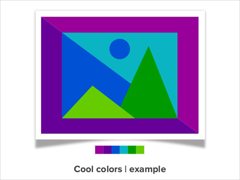
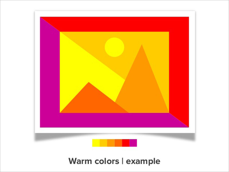
Color theory also distinguishes between warm and cool colors. Warm colors include reds, oranges and yellows while blues, greens and purples are considered cool colors.
The last thing to understand about color theory would be nuance. Every color you see is not a pure color. In fact, many colors online have been modified in one way or another.
Some colors will be tinted, which means white has been added to the color. Others will have shade, which means that black has been added to it. Grey can also be added to a color which is referred to as tone.
Colors can also be oversaturated or desaturated. Oversaturated and desaturated colors are colors that change how bright (oversaturated) or dull (desaturated) a color is. There are many different types of color nuances, but these are the main three that you need to know to ensure effective color combinations.
Think About Mixing Color Combinations
Every website has a color scheme, which are the color combinations you choose for your website. Depending on how many colors you want your color scheme may involve multiple color combinations. If you do combine colors understanding color nuances will be critical. You will have to learn why certain colors work together and how to modify these color to make them fit your color scheme.
There are 5 basic color combinations: monochromatic, complementary, split complementary, analogous, and triads / tetradic.
Monochromatic Colors are simply different color variations of the same color. This is usually accomplished with tints, shades, and tones which we already went over.
Complementary colors sit across from one another on the color wheel. For example, you could combine one warm and one cool color such as red with green.
Split complementary colors are made with one base color and two colors that are adjacent to the base color.
Analogous colors sit next to each other on the color wheel. Analogous colors are extremely similar such as blue and blue purple.
Triads / tetradic colors have a similar relationship to split complementary. Triads use color that are evenly spaced throughout the wheel (yellow, blue, red). Tetradic colors are four colors that have two pairs of complementary colors (red, green, blue and orange).
Using these color combinations can help you to create an attractive color scheme and an engaging website.
Keep It Simple
Remember to not make it too complex. Simplicity can be your ally. Keeping it simple will help you mesh together the different elements of your site easily. With a few colors your website will look unified.
Simplicity also helps your consumer to process everything that is going on in your website. Too many colors can make a site appear jumbled and will leave your consumers confused.
Evernote, an online note taking and task management site, does a great job of employing simplicity in their color scheme. The site employs an analogous color scheme of green and yellow that keeps its pages flowing.

Contrasting Your Colors
Contrast is another important element of good design when you are creating a website color scheme. Contrast helps create an impact, which will help draw attention to certain parts of a page
For example having a action button color that is different from your background color is a great way to draw attention to your CTA button. This helps your consumer focus on your call to action by having it stand out. If there is anything on your site that you want consumers to notice, contrast it from the rest of your page.
Integrate Your Branding
Finally, consider your branding and how it plays into your color scheme. If you already have a set branding then create your websites color scheme around that branding. Do not cause customer confusion by creating a color scheme on your website that does not mirror your existing branding.
Keep in mind that your brand colors might not be perceived well and could have a negative meaning in your space of business. For example, you may not want to use the color red as your main color if your business caters event planning and weddings. More suitable colors would be green or pink according to color pyschology. The main key here is to make sure your branding and your website have color association that fits your type of business and provides the right association with consumers.
It might take some trial and error to find your perfect color scheme so do not be afraid to experiment on your website. Hopefully these tips help your understanding of color psychology and guide you in creating the best color scheme for your website.